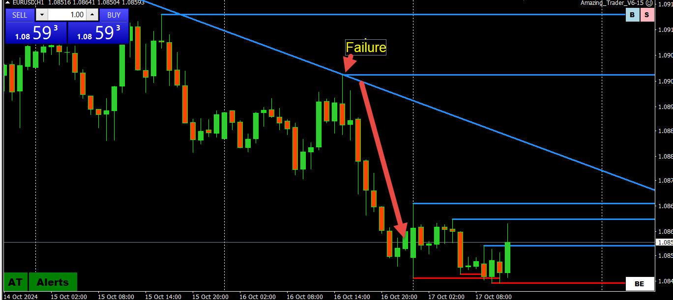
Take a look at these charts and then go to the Welcome Package in the Member Benefits page and watch the Day Trader’s Guide to Beating the Market video.
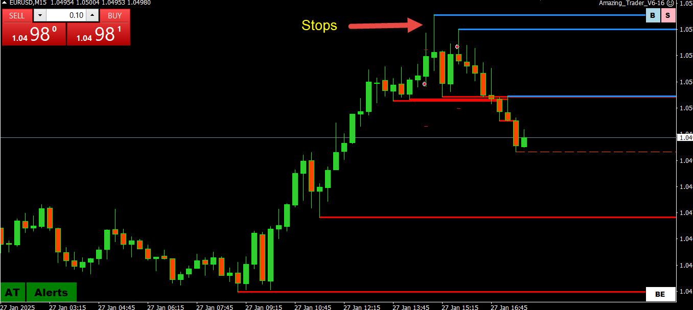
Look at this US500 chart after sell stops were exhausted and the low for the day was set.
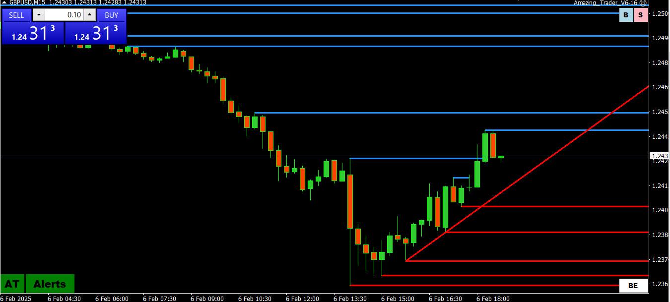
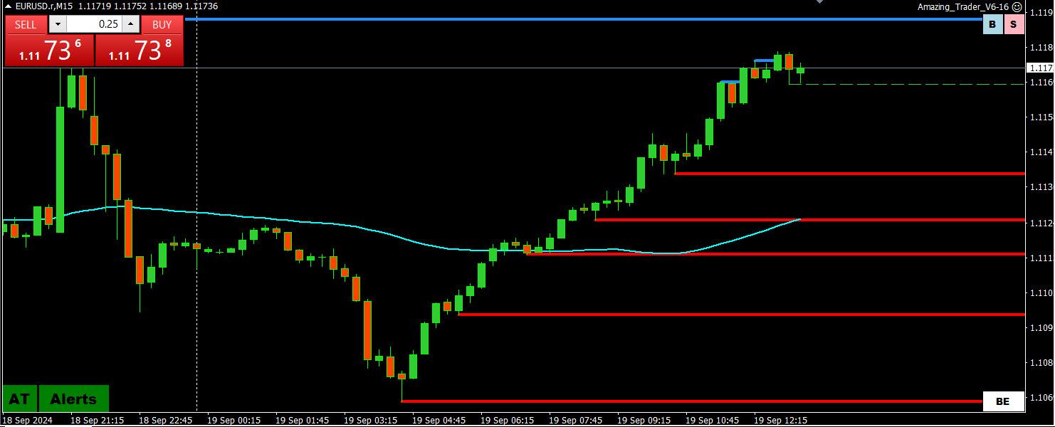
Look at this EURUSD chart and the price action after buy stops were run and the high for the day was set.
Here is a lesson that will at a minimum save you money
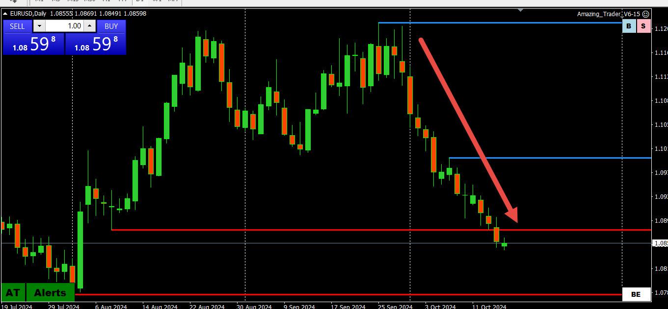
This chart is an example of a falling knife
Every trader likes to try and pick tops and bottoms.
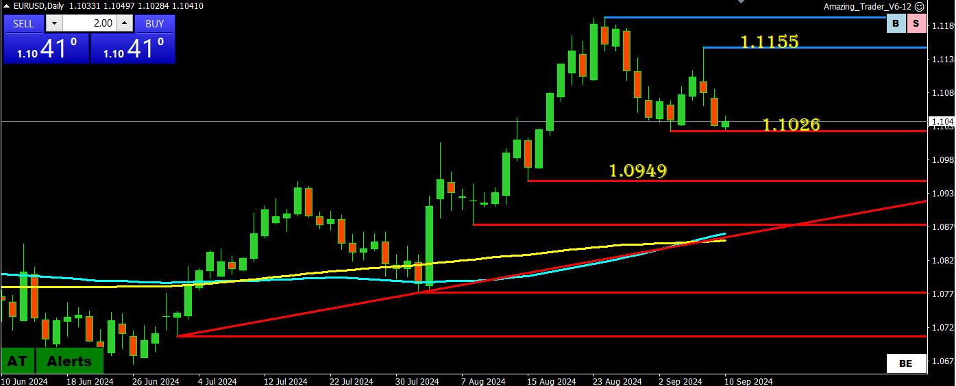
EURUSD has been moving higher this week and in fact traded to a new 2024 high earlier before retreating.
So the temptation is to look to pick a bottom at every pause and mini uptick.
BUT WHAT IS THIUS CHART TELLING YOU?
9 red down candles in a row with no retracement.
It is telling you not to try and catch the falling knife as the odds are against you unless you get lucky.
If you want to buy, be patient.
The better play, with hindsight, was to be short but that is easy to say than do. Those who subscribe to The Amazing Trader are shown how to do so in what I call The hard (to find a good entry) trade is more often than not the right trade.
The takeaway is when you see a one way move with no retracement, assume there is real money selling and don’t look to bottom or top pick until charts tell you it is okay to do so. This is not meant as a plug but the best way I know is by using The Amazing Trader.
In any case, don’t be a sucker when you see a one way move.
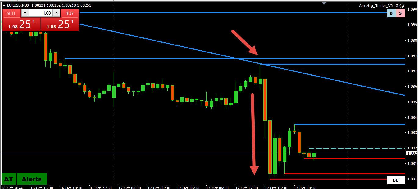
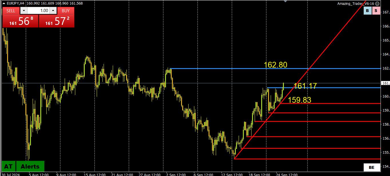
Look at the rising red AT ladder lines … this is a classic AT ladder pattern.. buying with a stop below the most recent preceding red line anywhere along the pathway would never have gotten stopped out.
This pattern can be seen on any time frame. If you don;t trade 4 hour charts, this pattern would tell you only to trade from the long side and look for an up ladder pattern on shorter time frames to trade.
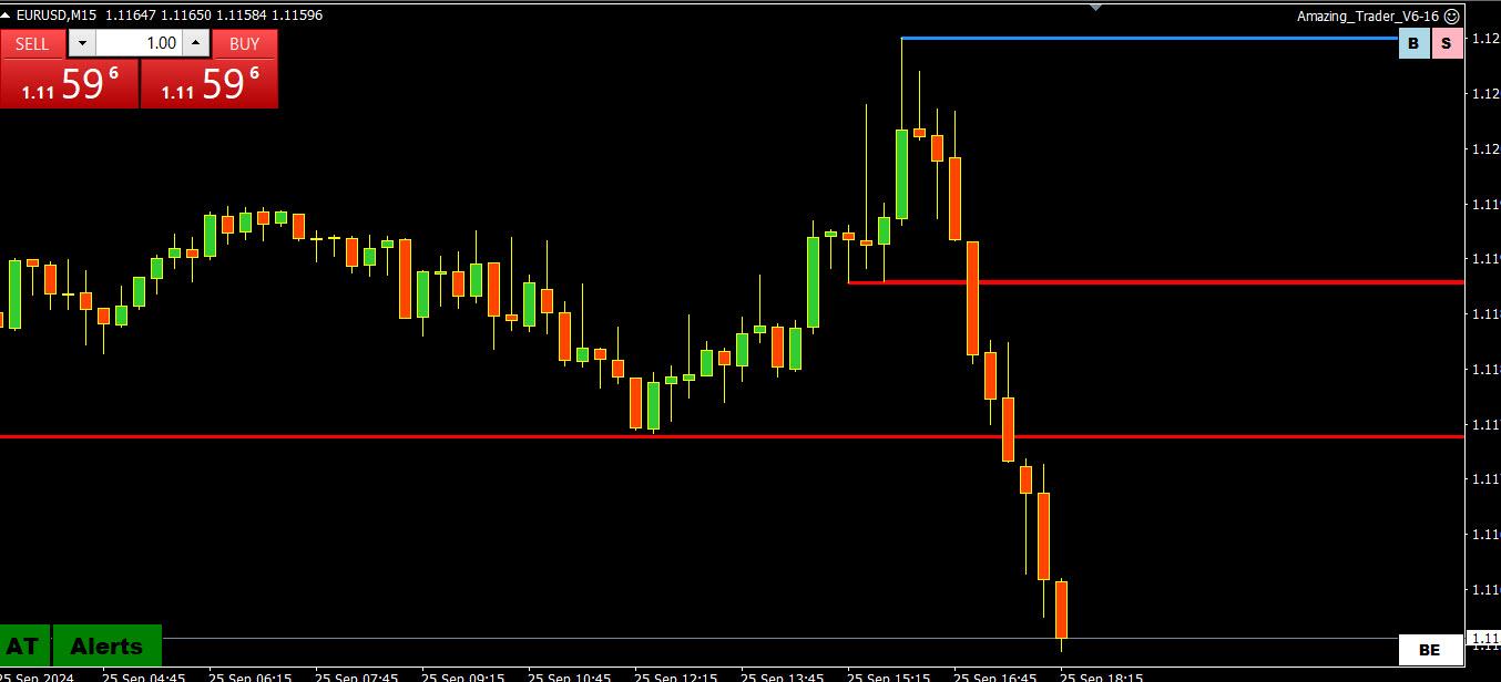
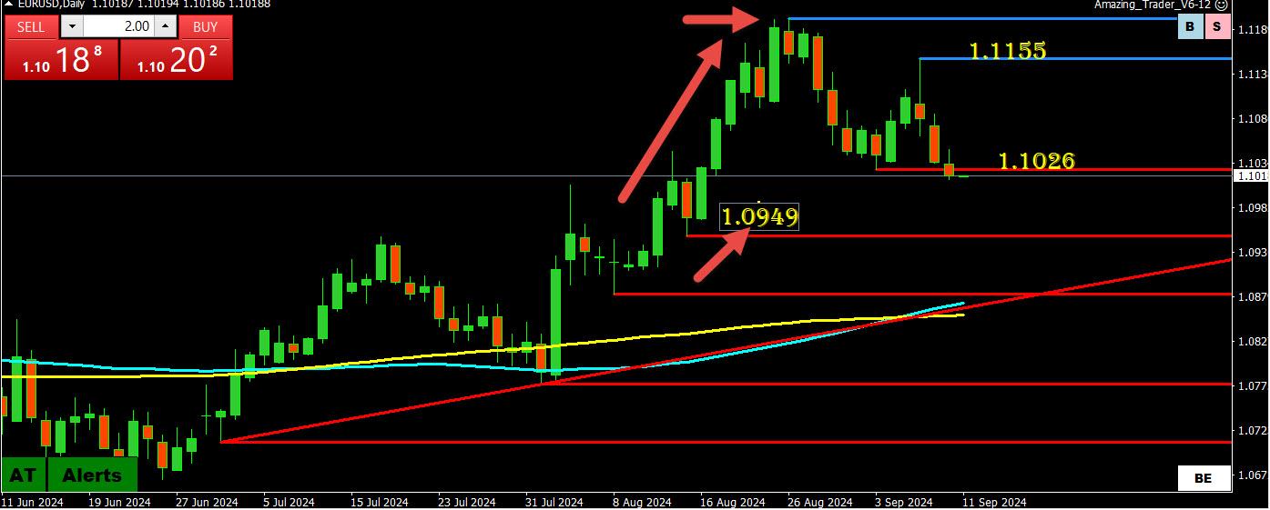
Using what I call AT (Amazing Trader) logic, key levels are the last key low that preceded a new high or the last key high that preceded a new low.
What I mean by a preceding low or high is an AT line.
If you look at this daily EURUSD chart, there were no red AT lines from 1.0949 => 1.1201.
This makes 1.0949 the preceding low/line ahead of the 1.1201 high and the key one on this chart.
The same logic can be used for shorter time frame trends.
But in any case, you can see why 1.0949 was more important than 1.1026 on a daily chart.
s always feel free to ask us any questions in the Q&A.
Those who have seen my charts posted have noticed that I use The Amazing Trader charting algo on them.
To be fully transparent, I hope our club members subscribe, not just to increase our subscriber base but because I feel there is nothing like it for trading. See why I say this…